
Visualization Tools :
In today's data-driven world , visualization tools play a critical role in turning raw data into meaningful insights . From interactive data visualizations to business dashboards , these tools help in analyzing and presenting complex information in a more understandable way . Whether you're a data analyst , a programmer , or a designer , choosing the right data visualization tool is essential for effective storytelling and decision-making .
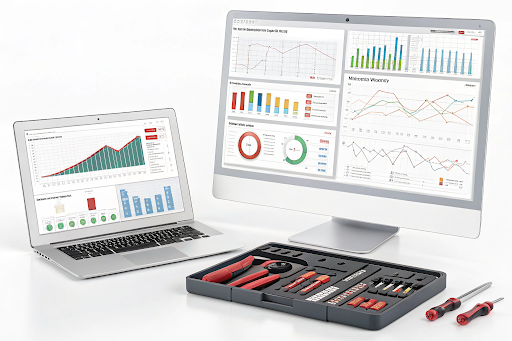
What Are Visualization Tools ?
Visualization tools are software applications that allow users to create graphs , charts , maps , infographics , and other graphical representations of data . These tools simplify large data sets , making it easier to identify trends , patterns , and anomalies . Data visualizations help businesses , researchers , and analysts to make informed decisions based on real-time insights .
Types of Visualization Tools
There are several types of visualization tools , each serving different specific visualization needs :
- Basic Visualizations: Includes bar graphs, box-and-whisker plots, and Gantt charts for simple data representation.
- Interactive Visualizations: Allows users to engage with data through interactive graphs, dashboards, and maps.
- Geospatial Visualization: Used for mapping capabilities, symbol maps, and locator maps.
- Infographics & Diagrams: Tools that focus on visual storytelling through infographics, diagrams, and visual elements.
- Programming-Based Tools: Require programming languages like Python and R for creating customizable data visualizations.
Popular Data Visualization Tools
Several powerful visualization tools are available , each with its own strengths :
- Tableau – A go-to tool for creating business dashboards and performing data analytics.
- Power BI – A Microsoft product that excels in analytics and dynamic dashboards.
- D3.js – A developer-friendly JavaScript library for crafting custom visualization styles.
- Google Data Studio – Free and ideal for integrating with other Google tools for effective data visualization.
- Infogram – A popular tool for creating infographics, visual representations, and data graphics.
Choosing the Right Visualization Tool
Selecting the right visualization tool depends on factors like ease of use, customization options , functionality , and integration capabilities . Here are a few considerations :
- For beginners: Use drag-and-drop visualization tools like Infogram or Canva.
- For businesses: Tableau and Power BI offer extensive dashboard features.
- For developers: D3.js and Python libraries (Matplotlib, Seaborn) provide extensive customization.
- For geospatial data: Use Google Maps API or QGIS for mapping and geospatial visualization.
Learning Data Visualization
For those interested in mastering data visualization techniques , enrolling in a Data science course in Lucknow can be a great step . These courses provide hands-on training in data visualization methods , visual design skills , and analytics platforms . The right visualization tools empower professionals to make data-driven decisions with clarity and precision . Whether you need simple visualizations or stunning visualization dashboards , leveraging the best tools can transform data into compelling insights . If you're looking to enhance your skills , consider joining a data-science-course-in-lucknow to gain expertise in effective visualizations and modern data visualization techniques .
.gif "Coding Clave Academy")